Specialty Coffee App - "First Crack"


Background
The world of specialty coffee is "an overwhelming rabbit hole" of information that is constantly changing.
The problem
Consumers need a way to discover new innovations and information about specialty coffees, because they have limited resources (like time and money). I designed an app that helps SC drinkers to find important information quickly without becoming overwhelmed.
Research & Discovery
I began by conducting seven interviews with individuals who identify as drinkers of specialty coffee.
- SC drinkers really value the sense of calm and "me time" they get from their daily coffee ritual.
- They enjoy both the art and the science of brewing coffee, and love to experiment with different coffees and brew methods.
- They could all agree that SC requires an investment in both time and money, but they each have different thresholds for an acceptable return on investment. Each interviewee mentioned the amount of time SC takes- three out of the seven people mentioned the overwhelming "rabbit hole" of trying to find information about SC.
I used this data to create three personas. My main persona (and the one I focused on for my app design) is Chauncey Cross.
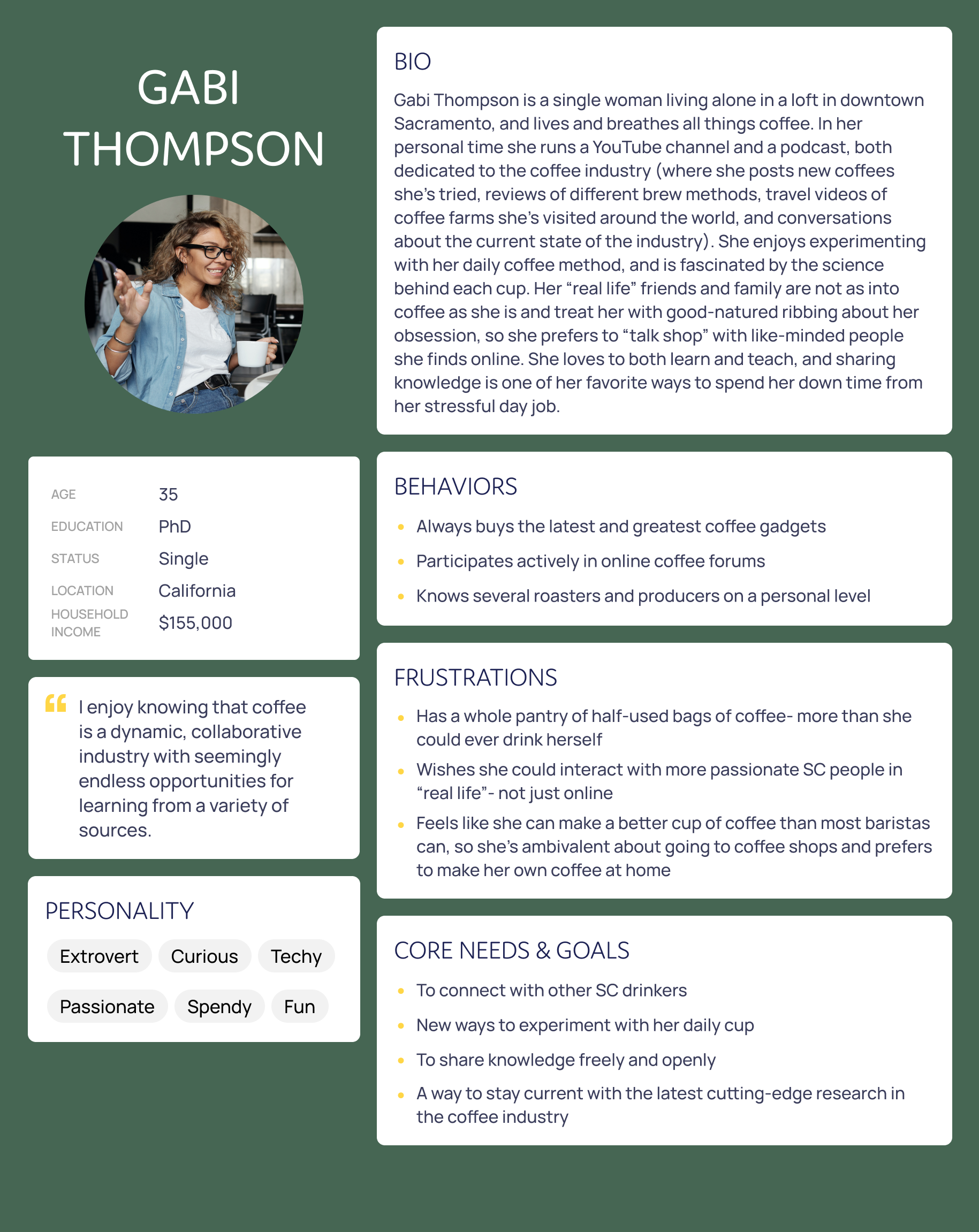
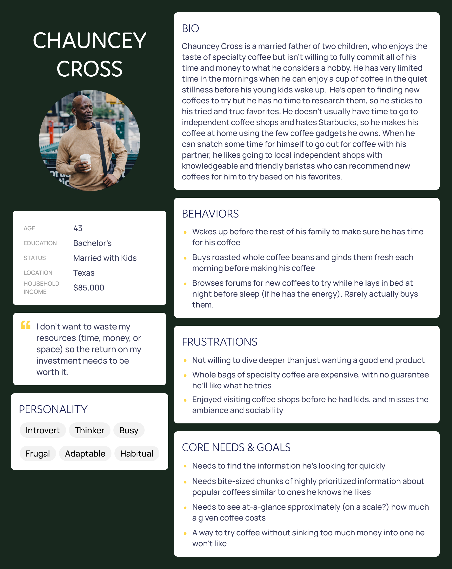
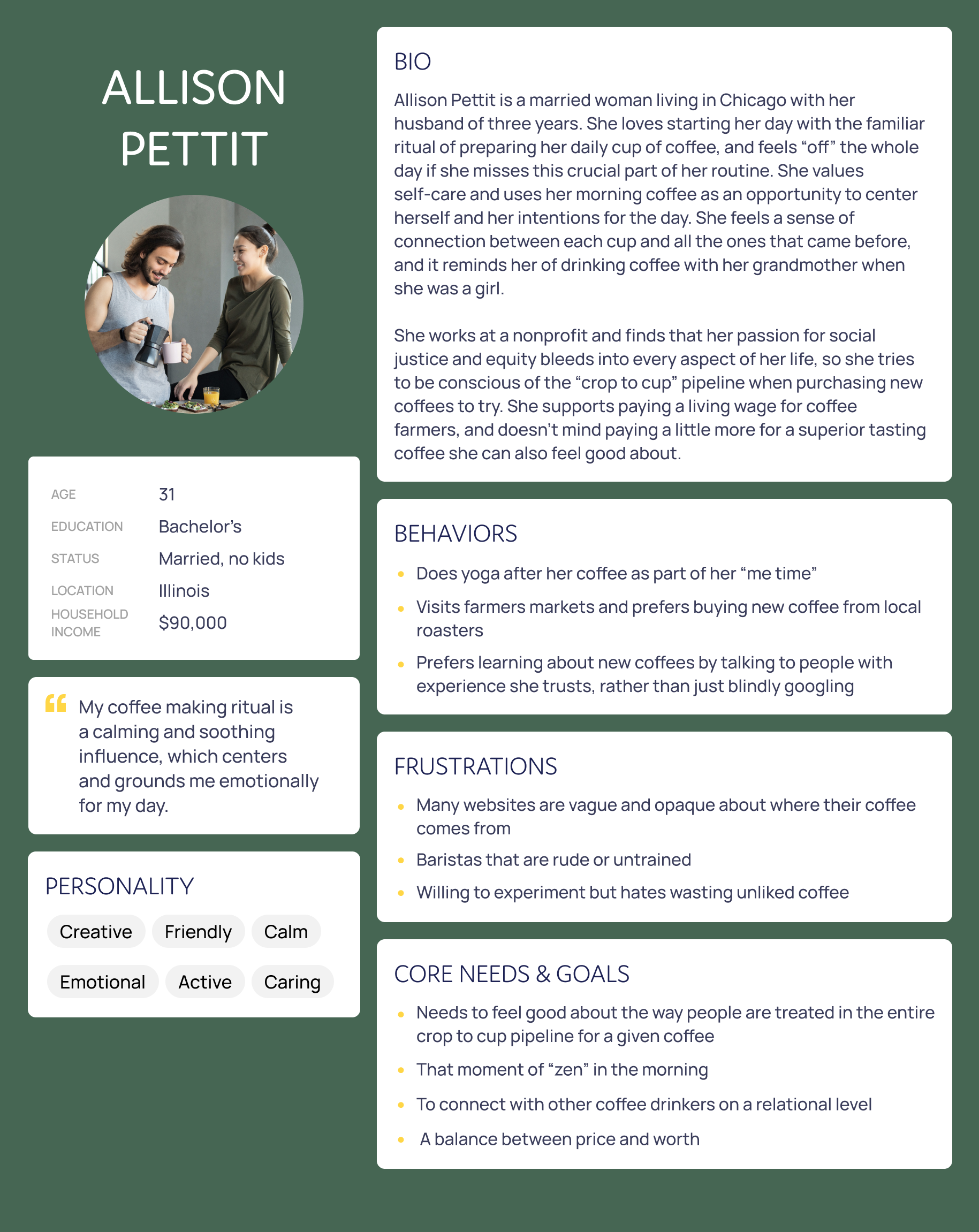
Main persona and two secondary personas- click to expand.
Early Sketches
I conducted a couple competitor task analyses, and determined there was a hole in the market for this idea. Keeping all the data (and my personas/users) in mind, I laid out a step-by-step user flow for my featured task. Once I felt like I had a good handle on how the interaction should function, I turned my focus to what it should look like.
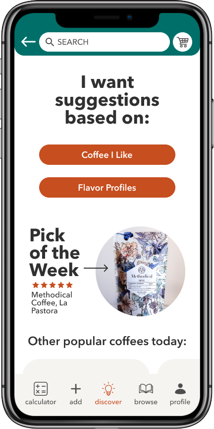
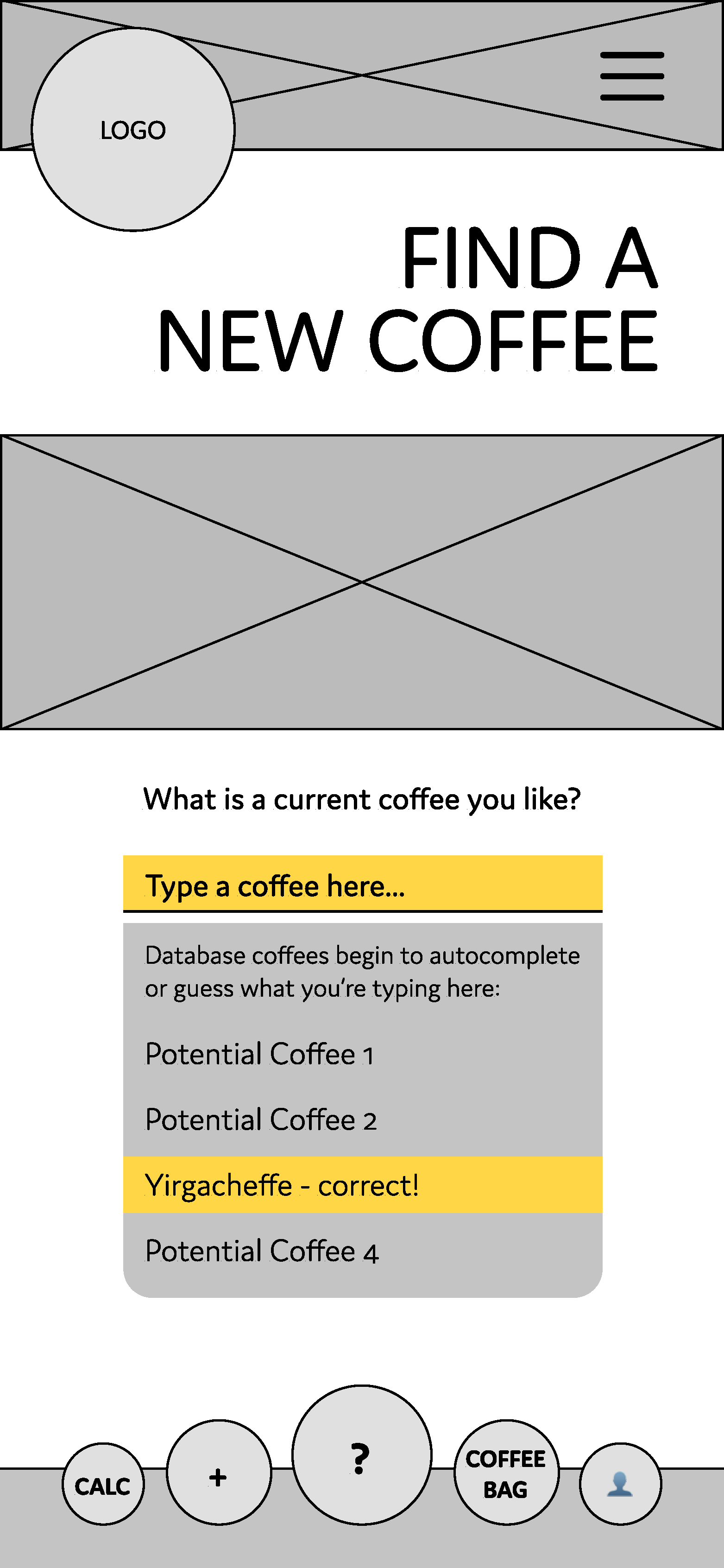
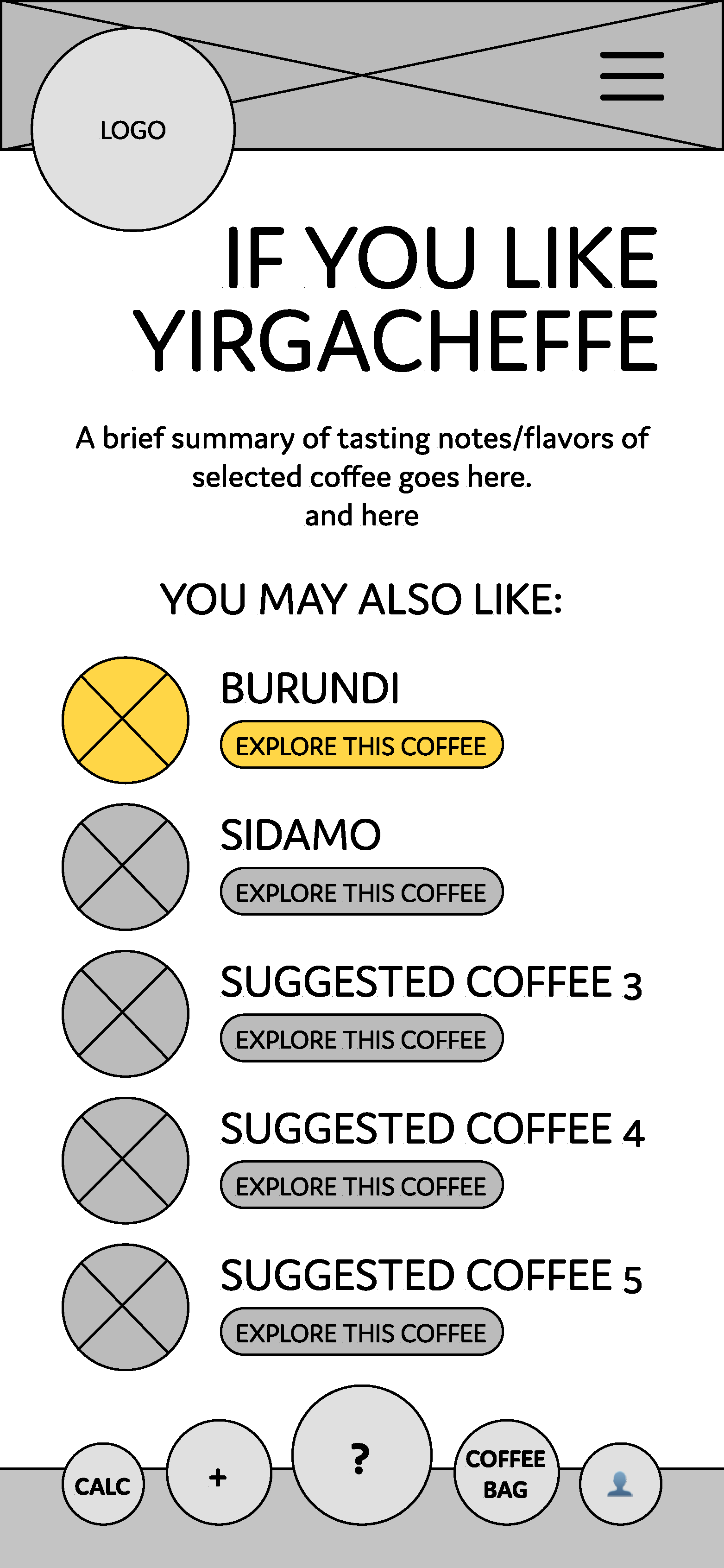
After using a 2x2 matrix method for feature prioritization, I consulted developers to determine difficulties of what I was proposing. Through collaboration/critique sessions with other designers, I determined that my MVP to ship would be a feature that returns five similar coffees when a user inputs a coffee that they already know they like.
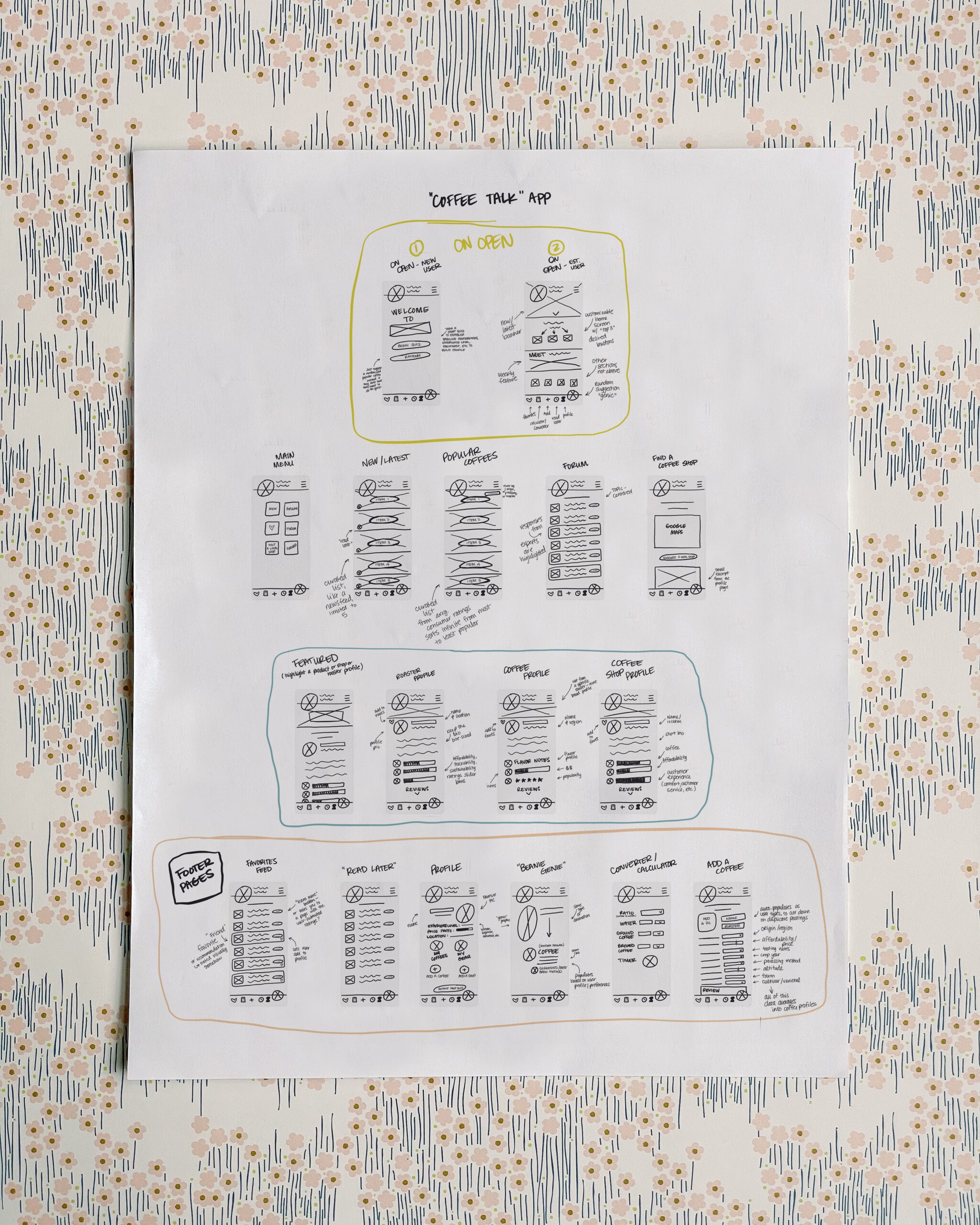
Early sketches- click to expand.
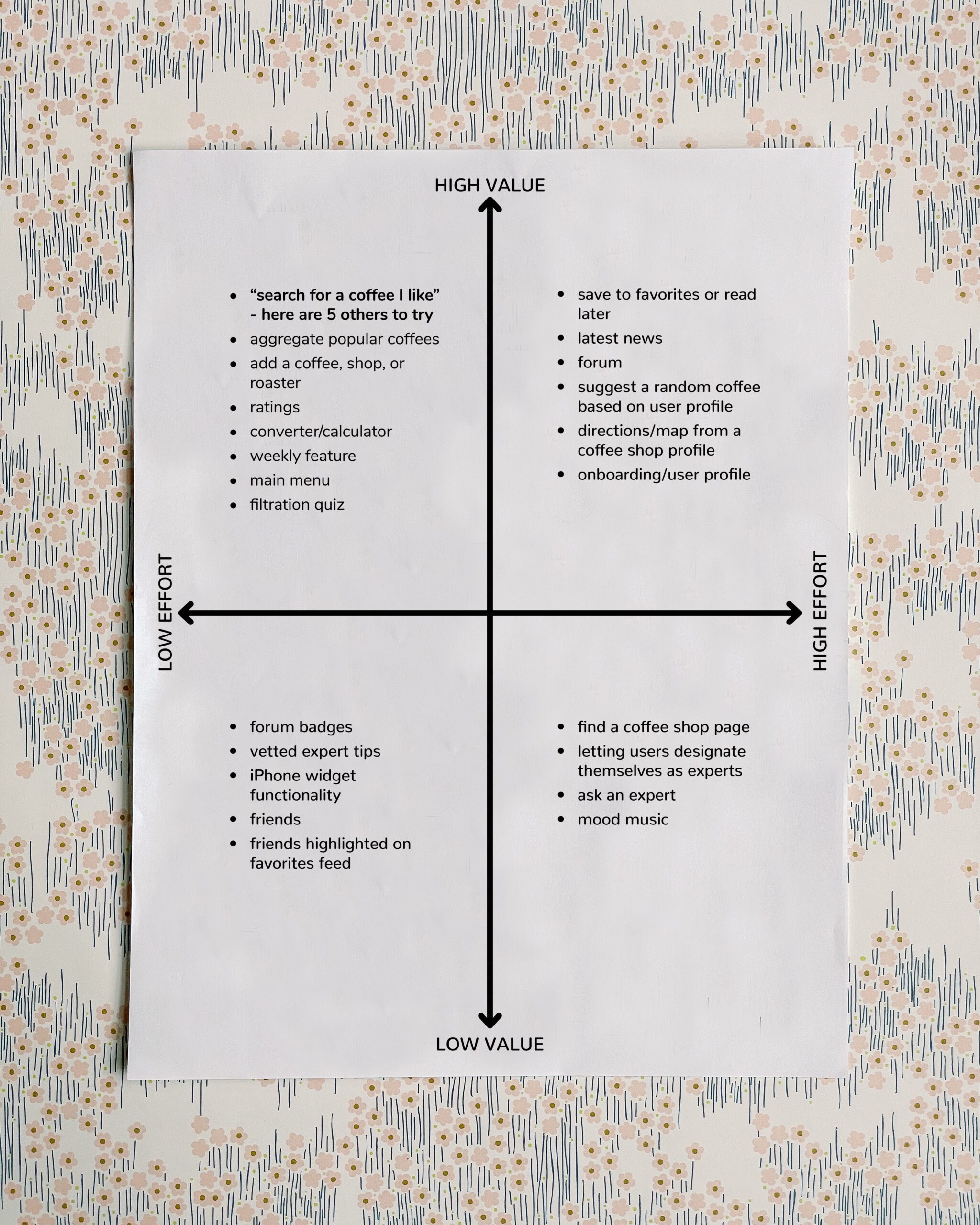
Feature prioritization- click to expand.
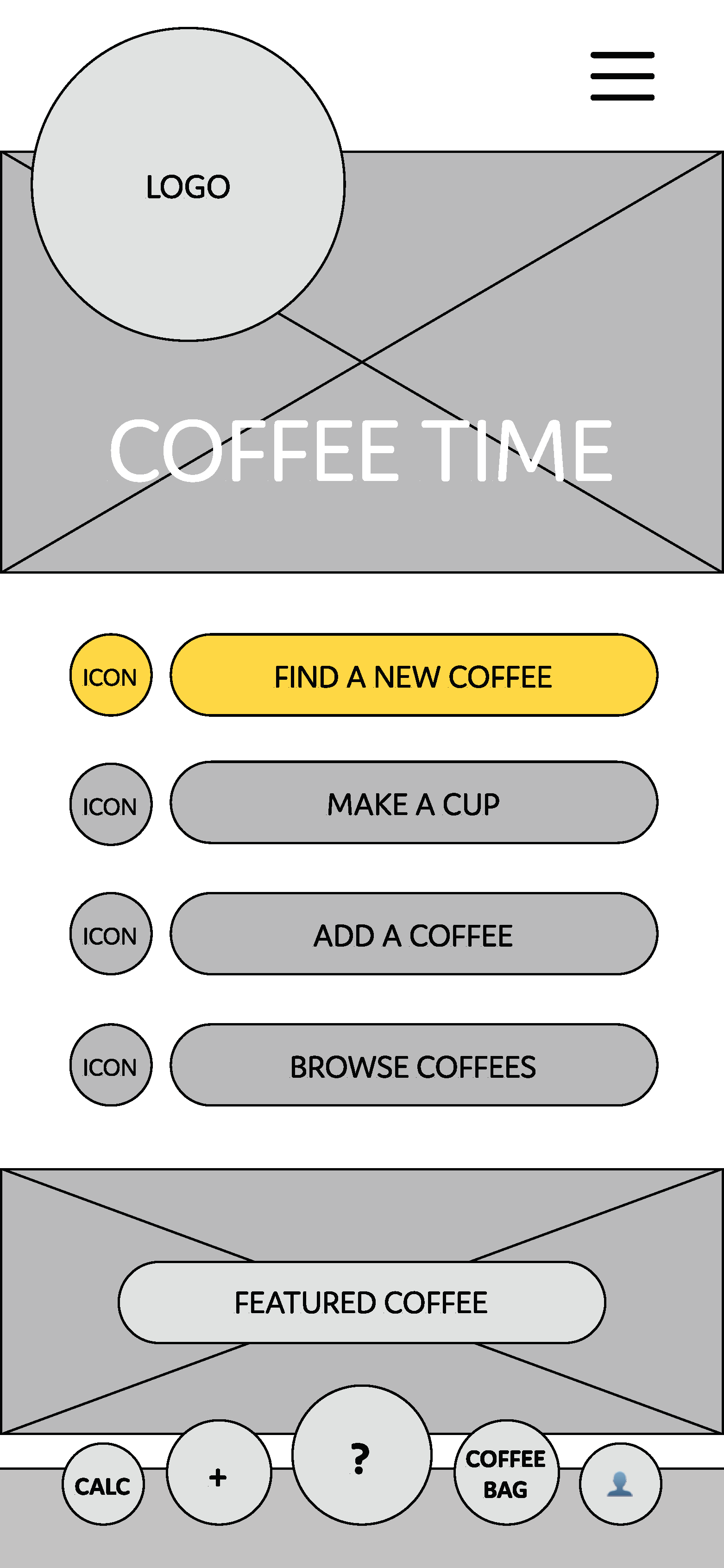
Dialing in the Design
Based on the feedback I received, I then created mid-fidelity wireframes. After several rounds of ideas and functionality, I prototyped my designs in Figma to make them interactive for further usability testing.
Identifying Issues
I tested my initial prototype with eight users, and received a lot of valuable feedback:
- confusing taxonomy
- incomplete navigation
- unexpected information architecture
Interestingly, I also had several requests for additional features that I had earmarked for phase 2, which was encouraging for future goals.
As I was making changes based on that user feedback, I also began developing a design system for this brand new business. Then I started a second round of user testing in Maze.
There were 9 out of 14 screens with a 100% success score, and 3 of the remaining 5 were above 90%. Average time spent on each screen was 3.1 seconds, there was a low mis-click rate (4%), and overall the rating given by testers was 4.1 out of 5.
Key Discovery
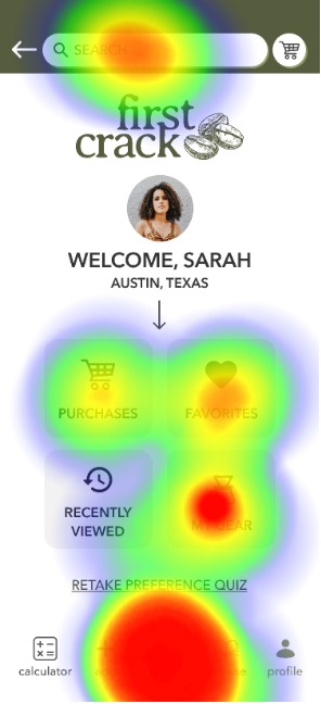
One area that failed usability testing was the open screen. The mis-click rate was unacceptably high, and several users got lost and began clicking around aimlessly on the screen trying to figure out where to go.
High mis-click rate: 50%
Unexpected paths: 31.25% of testers used unexpected paths, and 5 got lost
Average time spent on this screen: 8.6 seconds
"The home screen was confusing, I tried to click 'favorites' instead of 'discover.' Discover could be larger on that screen as well."
-tester quote
Next Steps
I need to conduct additional homepage testing and switch from the 'profile' page to the 'discover' page. Ideally this would cut down on confusion about where to go to begin the process of finding new coffees to try.
Once it begins populating with real users, I can conduct additional testing about the homepage functionality specifically, as well as the branding and UI.
Homepage
Set open screen to 'Discover' instead of 'Profile'
Additional User Testing
A/B testing on UI & Branding
Collect Usage Data
Troubleshoot & adjust existing features
Add Phase II Features
Follow-up testing with real users
In Their Own Words
Real Words from Real Testers
"I've been looking for this feature for years."
"I would take a lot of pride in using this app."
"This app feels really trustworthy."
"Please make this app- I would happily pay for it!"
"This is very intuitive and easy."
"I'm so mad you aren't making this for real. It would save me so much time!"
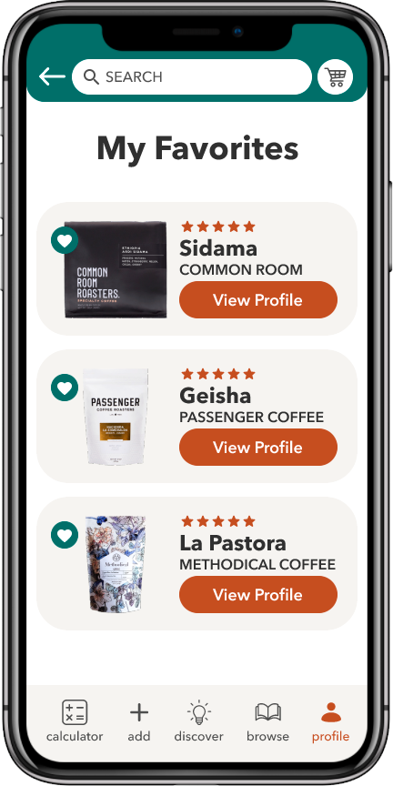
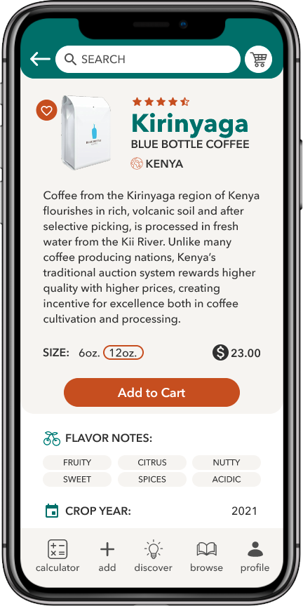
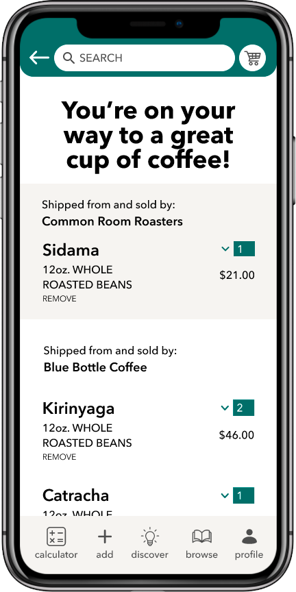
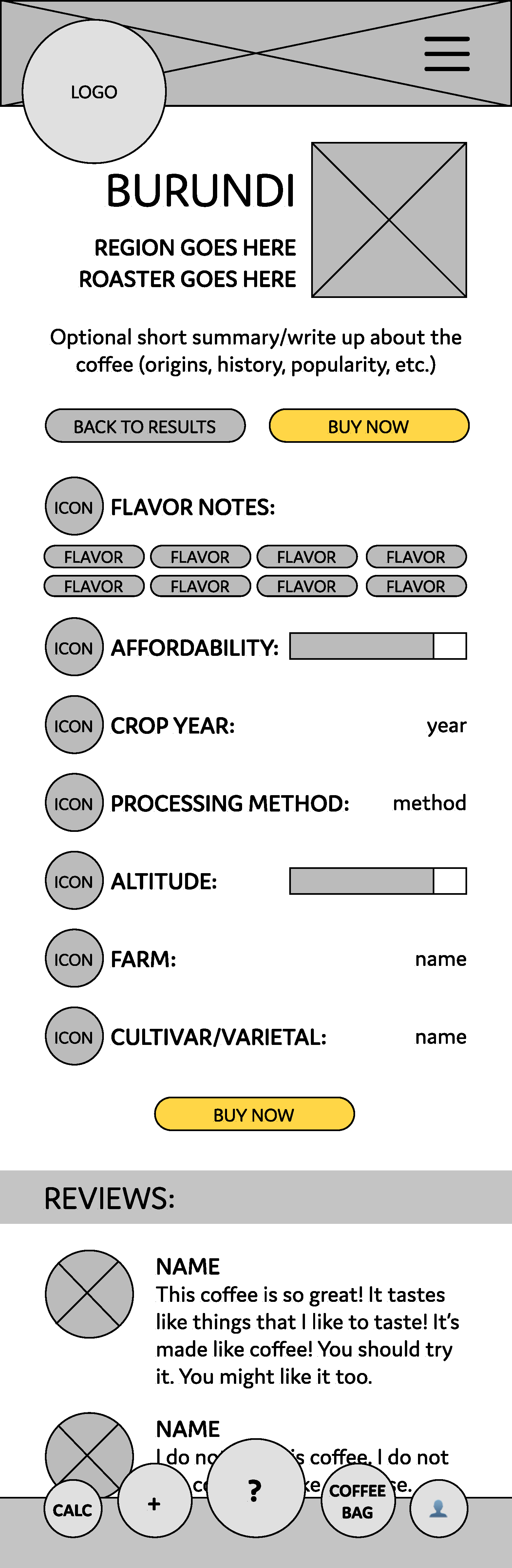
high-fidelity prototype
Click through the interactive prototype to view proposed functionality.
Users are able to find information about new specialty coffees quickly, from opening the app all the way through check out.
